
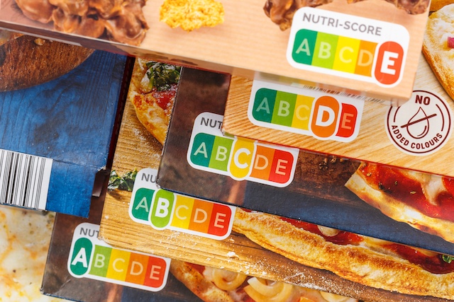
Visual Signals, Healthier Choices – Study Shows Colour-Coded Labels Influence Consumer Decisions
Key Takeaways:
- Colour-coded nutrition labels are more effective than traditional tables in guiding healthier food choices
- Red warning signals have a stronger behavioural impact than green positive cues, reflecting a “negative bias” in decision-making
- Simple visual labelling systems may support public health efforts to address obesity and poor dietary habits
The growing use of colour-coded nutrition labels
Colour coding on food packaging is becoming increasingly common, particularly as policymakers and manufacturers seek ways to guide consumers towards healthier dietary choices. A recent study conducted by researchers from SWPS University, the University of Wisconsin, and the University of Massachusetts suggests that these visual systems are significantly more effective than traditional nutritional tables.
The findings, published in Current Psychology, indicate that the effectiveness of colour-coded labels lies in how the brain processes signals of benefit and risk. Rather than requiring effortful interpretation, colour cues allow for rapid, intuitive judgements about a product’s healthfulness.
Obesity and the need for clearer nutritional guidance
According to the World Health Organization, overweight and obesity are major contributors to the development of chronic diseases. Over the past three decades, the proportion of children and adolescents in the United States who are overweight or at risk has more than tripled, reaching 37% and 34% respectively.
This trend has been driven largely by reduced physical activity and the increased consumption of foods high in fat and sugar. In response, clearer and more accessible nutritional labelling systems are being explored as tools to help people make more informed food choices.
How traffic light labelling works
One widely adopted approach is the traffic light labelling (TLL) system, originally developed in the United Kingdom. This system uses colours to indicate the levels of key nutrients such as calories, fat, saturated fat, sugar, and salt relative to recommended intake levels.
- Green indicates low levels, typically below 15% of the reference intake
- Red signals high levels, typically exceeding 25% of the reference intake
By translating numerical data into easily recognisable visual cues, the system allows consumers to assess a product’s nutritional profile at a glance.
“A picture is worth a thousand words”
The study aimed to explore the psychological mechanisms behind how people interpret these colour-coded labels.
“We decided to investigate the psychological mechanisms behind the reading of color-coded product labels. We drew on theories about verbal and visual information processing, as well as the perception of information in positive and negative contexts. We wanted to bridge a gap. Previous studies focused exclusively on consumer purchasing behavior and analyzed the extent to which color-coded labels influenced the choice of healthy food products,” says Professor Andrzej Falkowski, a business psychologist from the Institute of Psychology at SWPS University and the author of the study.
To examine this, researchers recruited 79 participants in the United States via Amazon Mechanical Turk. Participants were asked to evaluate products such as chicken noodle soup, ranch dressing, and peanut butter. These products were presented either with colour-coded nutrient indicators or with traditional text-based information.
Participants rated each product on a scale from 0 to 10, where 0 indicated “harmful” and 10 indicated “healthy”.
Faster processing, more intuitive decisions
The findings confirmed that visual information is easier for people to process than text. Colour cues are interpreted almost instantly by the brain, requiring minimal cognitive effort.
This enables individuals to make quick, instinctive judgements about whether a product is beneficial, even in time-pressured situations such as shopping. In contrast, traditional nutritional tables require more deliberate analysis, which may reduce their practical usefulness in real-world settings.
The power of red and the role of negative bias
One of the most striking findings was the disproportionately strong influence of the colour red. While green highlights positive attributes, red signals high levels of fat or sugar and prompts caution.
“This result also aligns with existing theories suggesting that negative events exert a stronger influence on behavior than positive ones. It is this ‘negative bias’ that makes color systems so effective. Red causes us to pause and reconsider a purchase,” Professor Falkowski emphasizes.
This asymmetry – where negative signals carry more weight than positive ones – was not observed with traditional labelling formats. Without clear visual cues, participants found it more difficult to distinguish between beneficial and harmful aspects of a product.
Improved consistency in consumer judgements
The study also found that colour-coded labels led to more consistent evaluations across participants. Because the visual system clearly differentiates between risks and benefits, individuals were better able to assess products in a uniform way.
By contrast, traditional descriptors such as “low fat” can be ambiguous and open to interpretation, particularly for those with limited nutritional knowledge. Colour coding, based on universally recognised traffic signals, offers a more accessible and intuitive alternative.
Implications for public health and obesity prevention
The researchers suggest that these findings have important implications for public health policy.
“Given the ongoing global challenges of obesity and poor dietary habits, color-coded labeling represents a simple yet impactful strategy for guiding healthier consumer choices,” Falkowski says.
By enhancing the visibility and clarity of nutritional information, colour-coded systems may encourage people to select healthier options. Over time, such behavioural shifts could contribute to improvements in population health.
The authors conclude that leveraging visual attention mechanisms and simplifying complex nutritional data may be a practical and scalable approach to addressing poor dietary habits and the global rise in obesity.
CCH insights:
The results of this study supports the use colour-coded labelling system as it enables quick health-based decision-making, with minimal time or effort required. And it also revealed that we use the system more to avoid unhealthy ‘red’ foods than to actively choose healthy ‘green’ foods. These outcomes emphasise the complex range of factors that contribute to shopping behaviours and decisions about what people eat. And if we want to encourage people to eat healthily, we need to understand these factors better and consider how best to influence them.